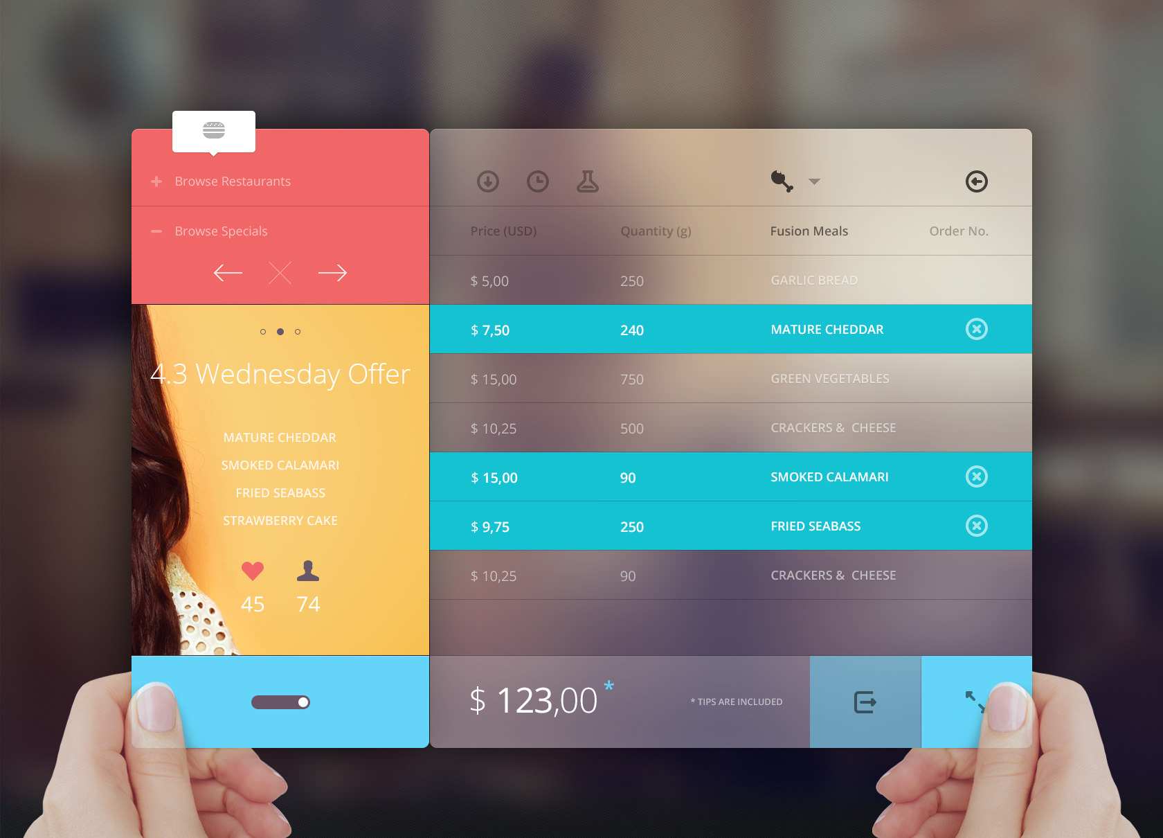
Simple is good. Why avoid complex User Interfaces
Audio : Listen to This Blog.
There has been a heavy debate sprawling over the world off-late over the concept of UI’s that have become oh so important recently. What is ideal when it comes to developing an interface design? How many features to include? How many to exclude? And furthermore how complex or simple should the UI exactly be? These are questions commonly asked when creating initial layouts as to how an app would look and feel.
John Gruber said, “If your UI has even the slightest, vague resemblance to and airplane cockpit, you’re doing it all wrong.” These words coming from a design tech great is not only skin deep. It gives us, probably what we would say, “the most idealistic grounds to base a UI design on”. Most UI designs fail because of a lack of understanding of the thin line between what’s complex and what’s complicated. Complex designs can be simple but simple UI design doesn’t necessarily mean complicated. When it comes to UI design, keeping it simple goes a long way. Innovative, minimalistic and interactive UI’s have been a hit for a long time and will continue to be. Let’s consider a few points to discuss on a simpler, innovative UI design.

Minimize
While building a simple UI design, make sure that all features are made minimalistic and all unnecessary clutter and add-on features do not take up the primary space on the interface. Let the icons be minimalistic and self-explanatory. The whole point of an interface design is to serve a purpose and it should pretty much do that without limiting the usefulness of it. A good design should put forth the features in an interactive, easy to understand and engaging ways.
Trade-Off
Designing an UI is more of a compromise between keeping it simple yet making it alluring to the eyes of your target customers. Its human psychology to get more out of less and anything that offers “options” appeals. The UI designers need to make sure that they achieve this balance for satisfactory results and more importantly, likeability. It needs to offer features in a way that it appears engaging yet at the same time maintains not being abstruse, hence, again, focusing on the “complex yet simple” paradox. Balance is thus the most crucial element of an UI design and that’s the real trade-off.
Equalize
Another important component that should be in a primary view of designers is to maintain a subtle pattern throughout the design. Using different patterns for similar elements can make the UI design confusing and complicated. However it should be kept in mind that de-establishing the groups and keeping the pattern subtle is an essential. Making interface without maintaining an equalizing one can make the interface boring and non-engaging. This could turn out to be a problem.
Grouping
Grouping related elements together, before working on a design to keep the balance steady and to maintain flow is an ideal way people like their interface. However the grouping should not be too strong and rigid, so as to provide a brilliant simple UI design experience.
Overall, a simple design for your UI doesn’t necessarily have to be basic. There are many ways in which, a simple and an appealing UI can be designed if the above given points are focussed on accordingly.


