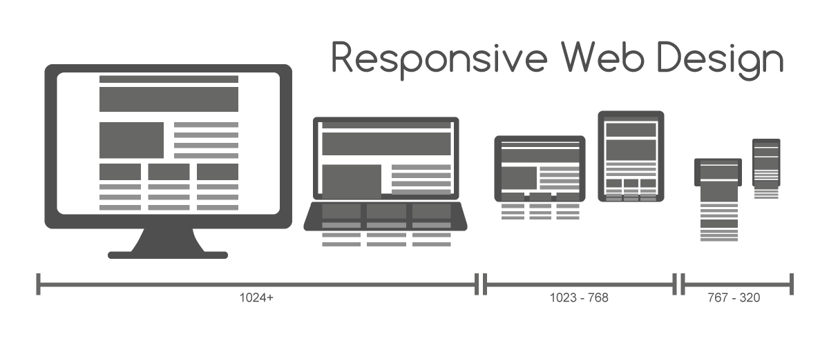
Responsive Web Designing
Audio : Listen to This Blog.
Responsive web design is a Revolutionary web design approach aimed at crafting sites to provide an optimal viewing experience—easy reading and navigation with a minimum of resizing and scrolling across a wide range of devices (from desktop computer monitors to mobile phones).
The world is going mobile, more and more people and moving away from desktop in favor for smartphones and tablets when it comes to browsing the web. Various studies show that the mobile usage of the web will be higher than from the desktop within the next 2 to 5 years.
“Stop Thinking in Pages. Start Thinking in Systems.” – Jeremy Keith
Why Responsive Web Designing?

As the days have progressed, people have started using Mobile devices or Tablets to do all their basic life activities – From as simple as reading a Newspaper to as complex as purchasing vehicles.
The designers/ developers are thus required to design and develop the web products which would be accessed by the mobile users at ease, hence targeting more users and driving traffic on to their site.
How is RWD done?
In simple terms, a responsive web design uses “media queries” to figure out what resolution of device it’s being served on. Flexible images and fluid grids then size correctly to fit the screen.
If you’re viewing this article on a desktop browser, for example, try making your browser window smaller. The images and content column will shrink, and then the Menu bar will disappear altogether. On our homepage (www.mobinius.com) you’ll see the layout shrink from four columns, to two columns, to a singular column of content.
Core Concepts of RWD:
Four key technical features are the heart of responsive Web design:
* Media queries and media query listeners
* A flexible grid-based layout that uses relative sizing
* Flexible images and media, through dynamic resizing or CSS
* Setting viewport to device-width using the meta tag
Why 2013 is the year of Responsive Design?
Given the rapid adoption of tablets and smartphones — and the fact that users currently seem to prefer reading their news on the mobile web rather than in apps —I think it’s certain that 2013 will be the year that responsive design takes off.
For publishers, it offers the simplest way to reach readers across multiple devices. For users, it ensures a great experience on every screen.
Native Apps v/s RWD
Pros
* Can provide a slick user experience
* Can more easily access device features (camera, GPS, etc.)
* Available for offline use
Cons
* Very expensive
* Hard to do well
* Which platforms do you support?
* Your users (probably) don’t want a native app
* You still need a website
Advantages of Responsive Web Designing:
* Only have to maintain a single website
* Simpler management of Content
* Improves SEO of the website
* Addresses a wide multitude of devices: phones, tablets, desktops, etc.
Best Practices for designing a Responsive Website:
* Start Small – Mobile first designing
* Exit Photoshop, Enter Browser
* Responsive font-size- Use ‘em’ for font-size rather than ‘px’
* Use Responsible Menu (drop-downs or Off-canvas fly outs)
* Use Simple, but effective footers
* Make use of the native navigation/GPS when designing for Mobile devices
* Make use of ‘mailto’ and ‘tel’ in anchor tags for better User Experience
Frameworks:
There are many frameworks which implement RWD. Here are some of the my favorite frameworks that are used for web application development
* Foundation
* Goldilocks
* Skeleton
Best Examples
Apart from the current site you are viewing, here are more examples of Responsive Web Designing
*fhoke
*HTML5Rocks
*Cargomedia
*Bostonglobe
*Smashingmagazine
So, in short if you are wondering if you have to implement Responsive Web Designing for your websites, the answer is Hell Yes! Go ahead, develop your websites which are future-friendly and showcase the latest technology.


